Client: Leão (The Coca-Cola Company)
Studio: Pharus Bright Design
Creative Direction: Louise Haas
Graphic Design: Caio Oviedo; Rodrigo Gondim
Motion Design: Caio Oviedo
Typography: Pandemonium Type
Photography: Estúdio Tango
Studio: Pharus Bright Design
Creative Direction: Louise Haas
Graphic Design: Caio Oviedo; Rodrigo Gondim
Motion Design: Caio Oviedo
Typography: Pandemonium Type
Photography: Estúdio Tango
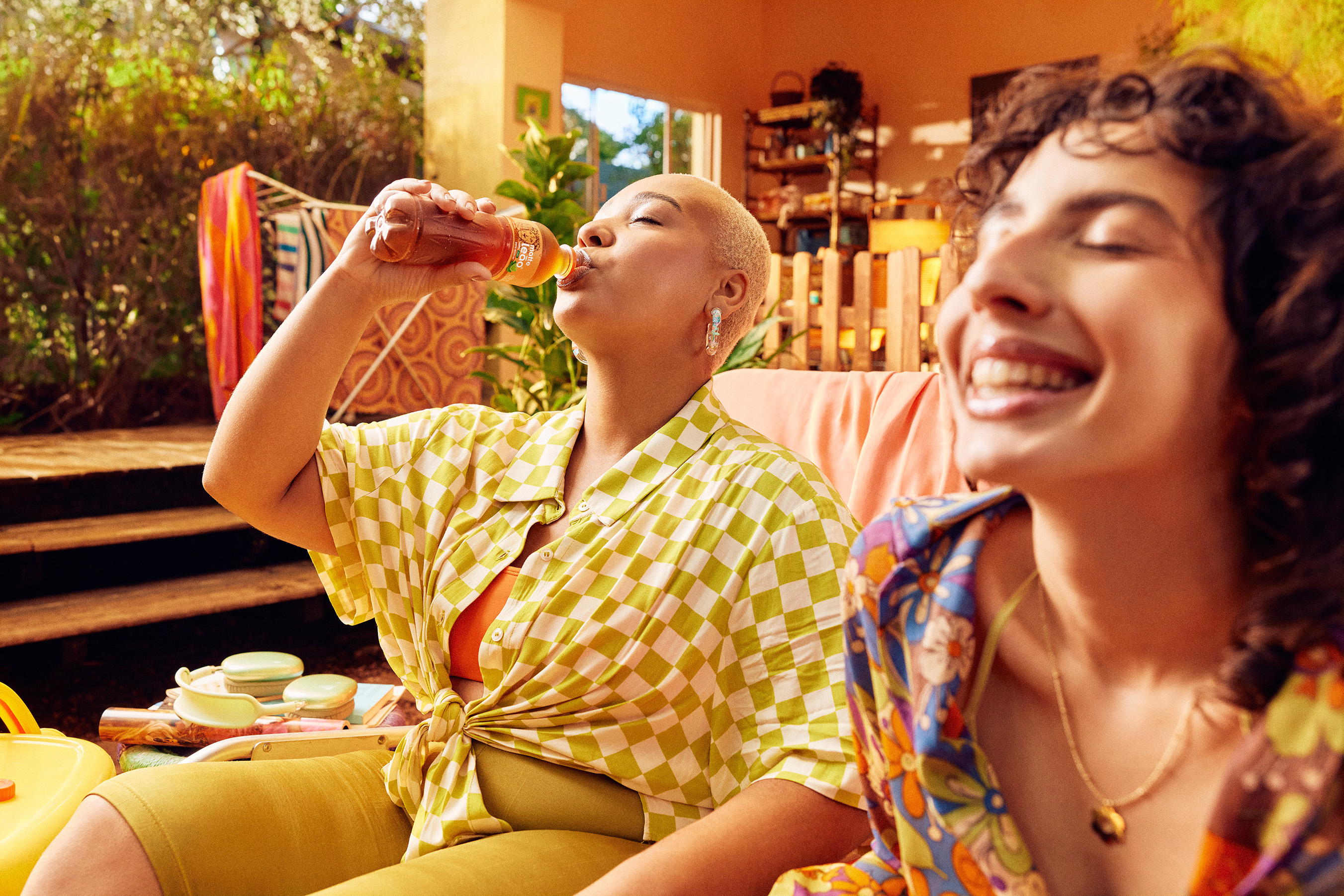
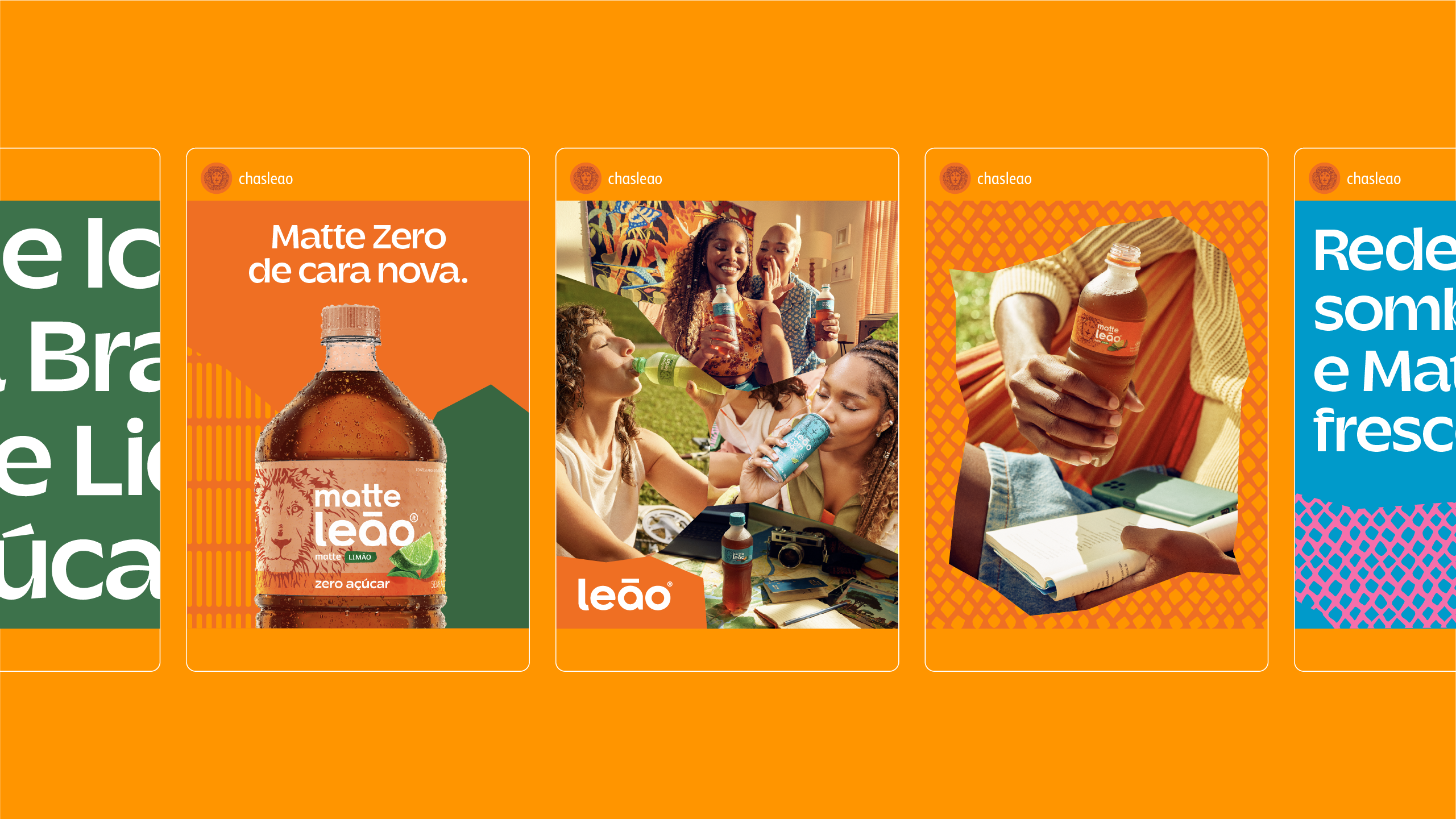
Leão is a company within Coca-Cola Brazil system, with over 120 years of experience in Brazilian market. It is a category leader in the Ready-To-Drink tea segment and a market reference for solutions and consumption options that promote care and well-being.
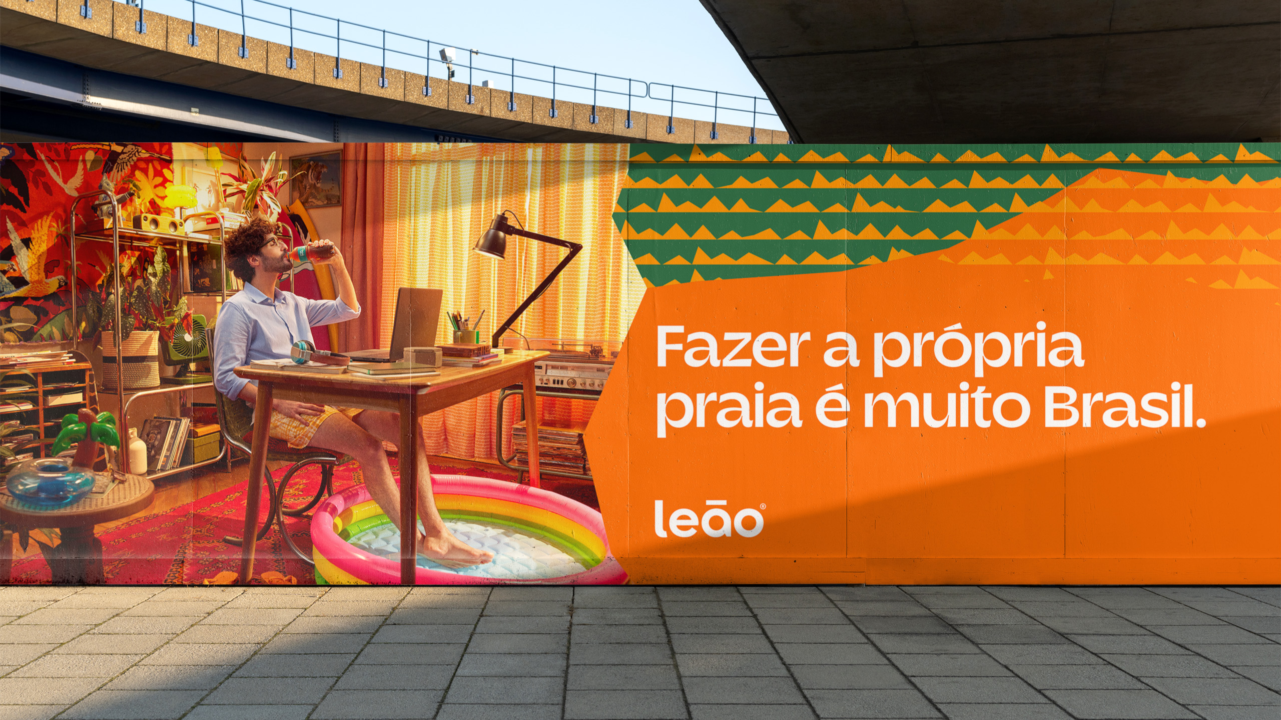
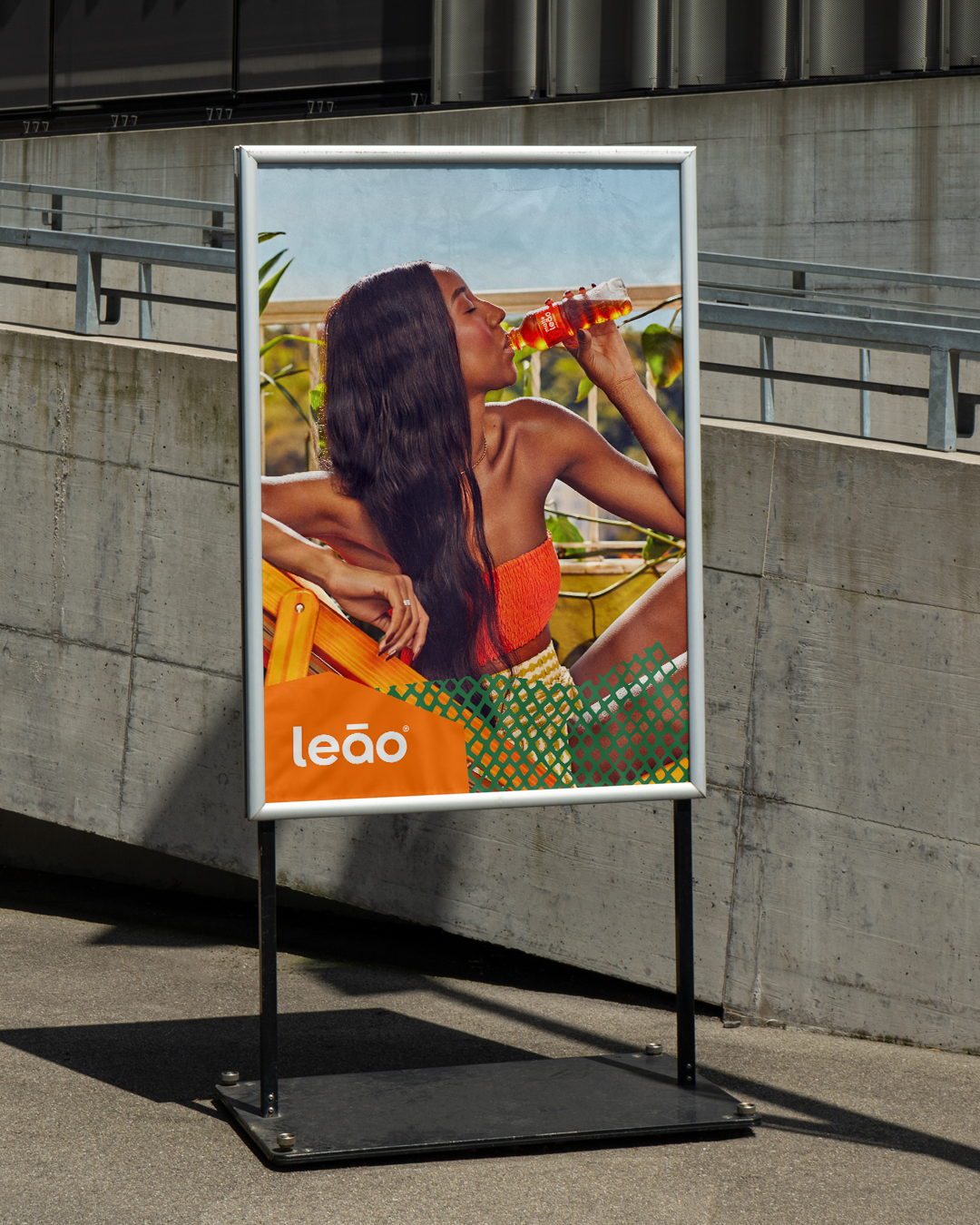
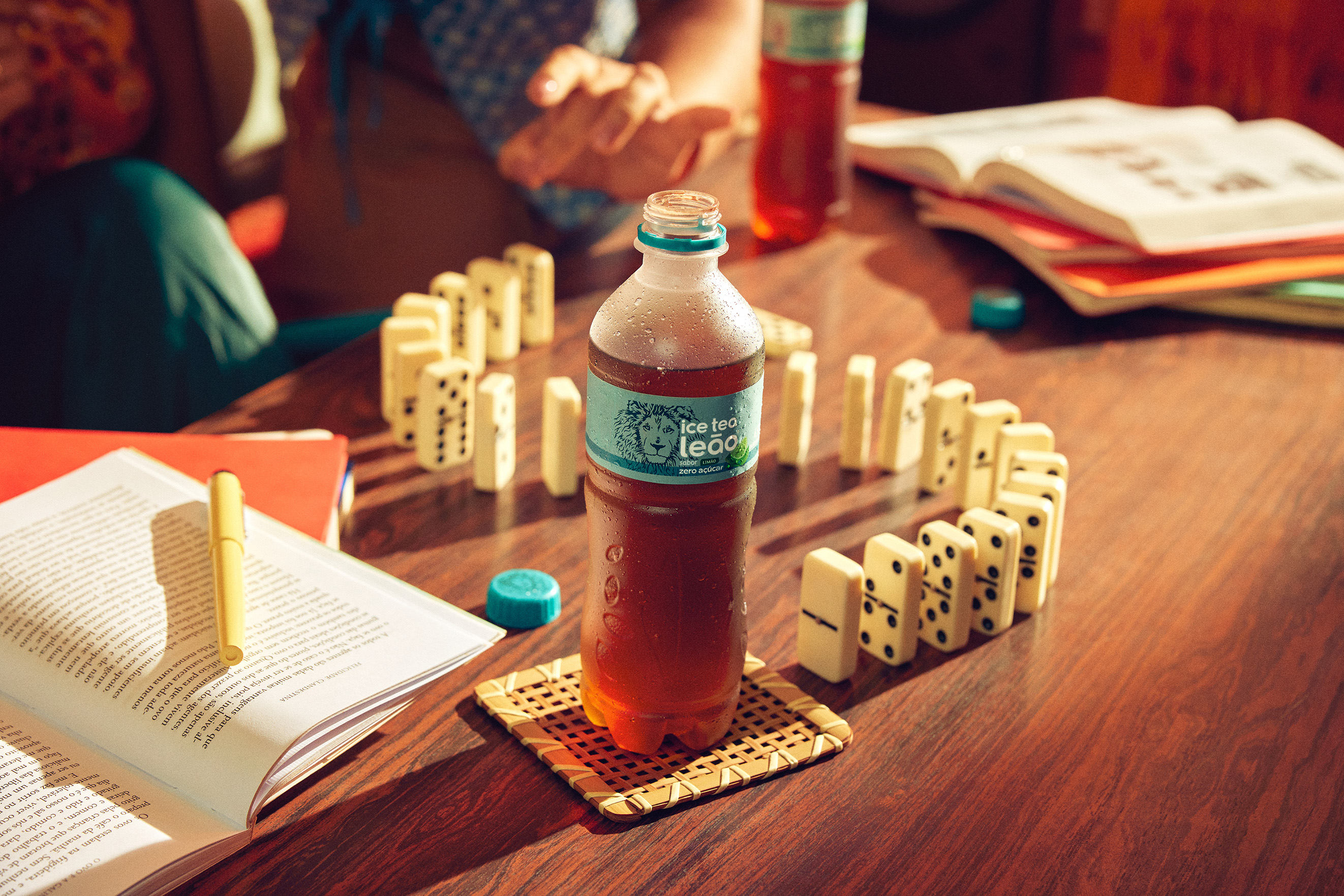
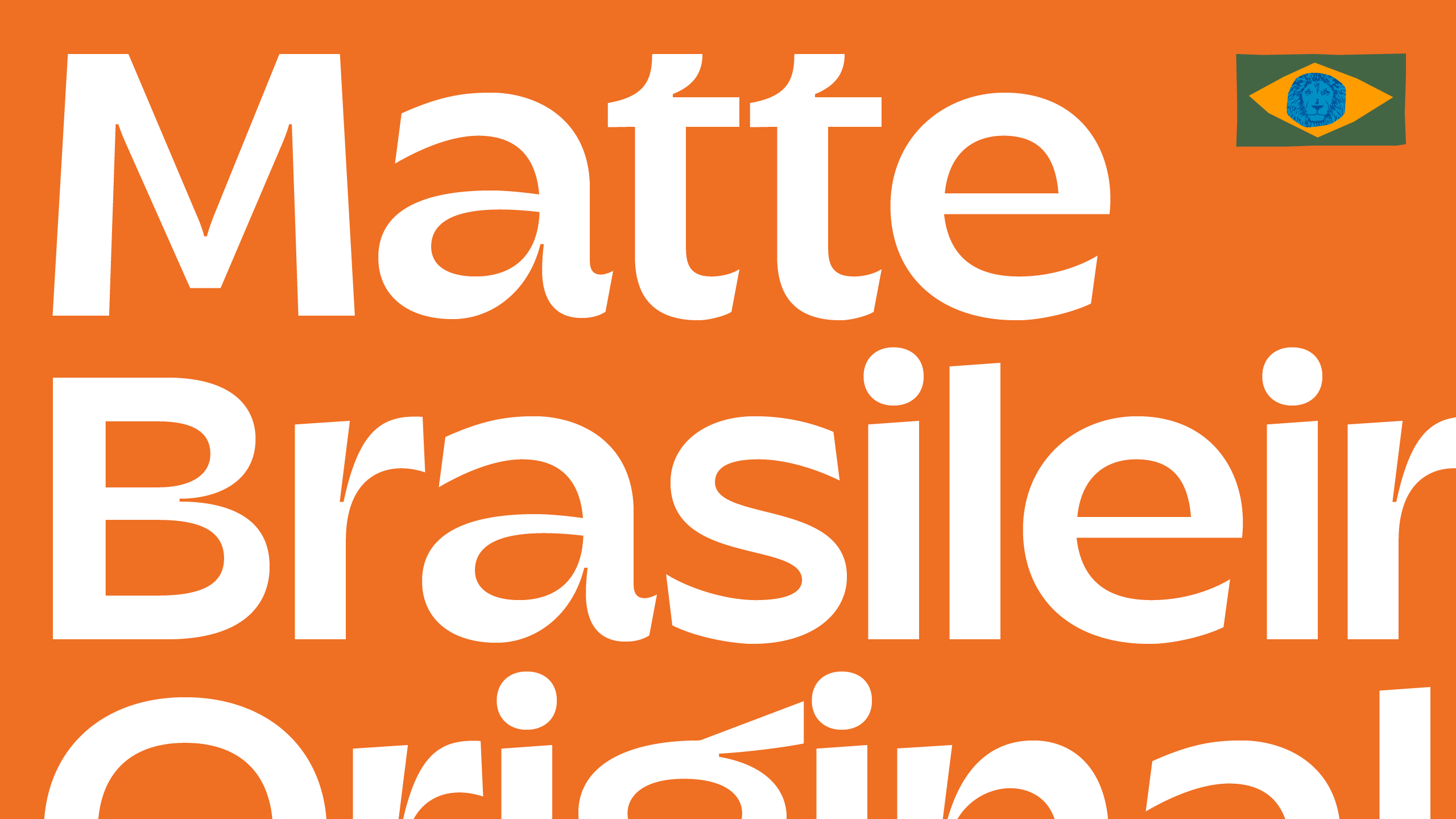
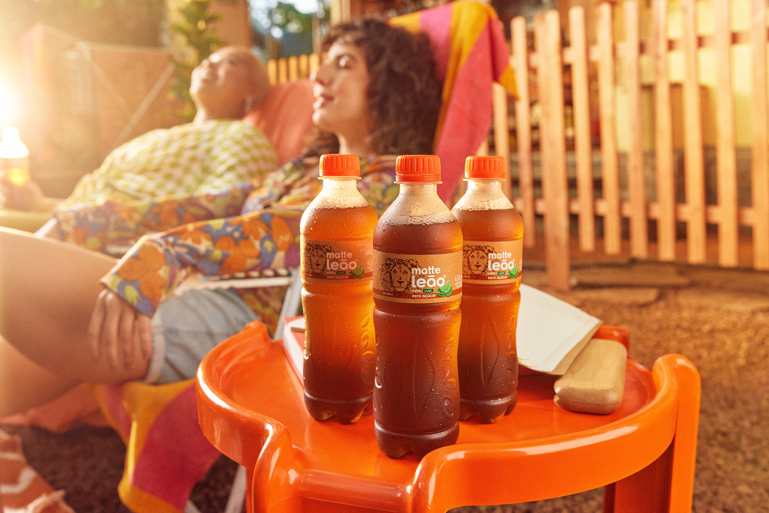
Looking forward to embrace its Brazilian roots, Leão's visual identity has inspiration from the vibrant and democratic nature of the traditional “feira livre” (street market). The design reimagines the brand’s packaging with renewed colors, a custom typography, motion design system and patterns inspired by elements found in this iconic Brazilian event. This transformation amplifies Leão's national identity while preserving its iconic brand assets, ensuring a strong connection with diverse consumers across the country.
Looking forward to embrace its Brazilian roots, Leão's visual identity has inspiration from the vibrant and democratic nature of the traditional “feira livre” (street market). The design reimagines the brand’s packaging with renewed colors, a custom typography, motion design system and patterns inspired by elements found in this iconic Brazilian event. This transformation amplifies Leão's national identity while preserving its iconic brand assets, ensuring a strong connection with diverse consumers across the country.







Client: R.TMO Festival
Studio: Freelance Project
Graphic Design: Arturo Campedelli; Caio Oviedo
Motion Design: Caio Oviedo
Photography/Video Content: Fernando Schlaepfer; JapaUm; Pedro Fatore
Studio: Freelance Project
Graphic Design: Arturo Campedelli; Caio Oviedo
Motion Design: Caio Oviedo
Photography/Video Content: Fernando Schlaepfer; JapaUm; Pedro Fatore
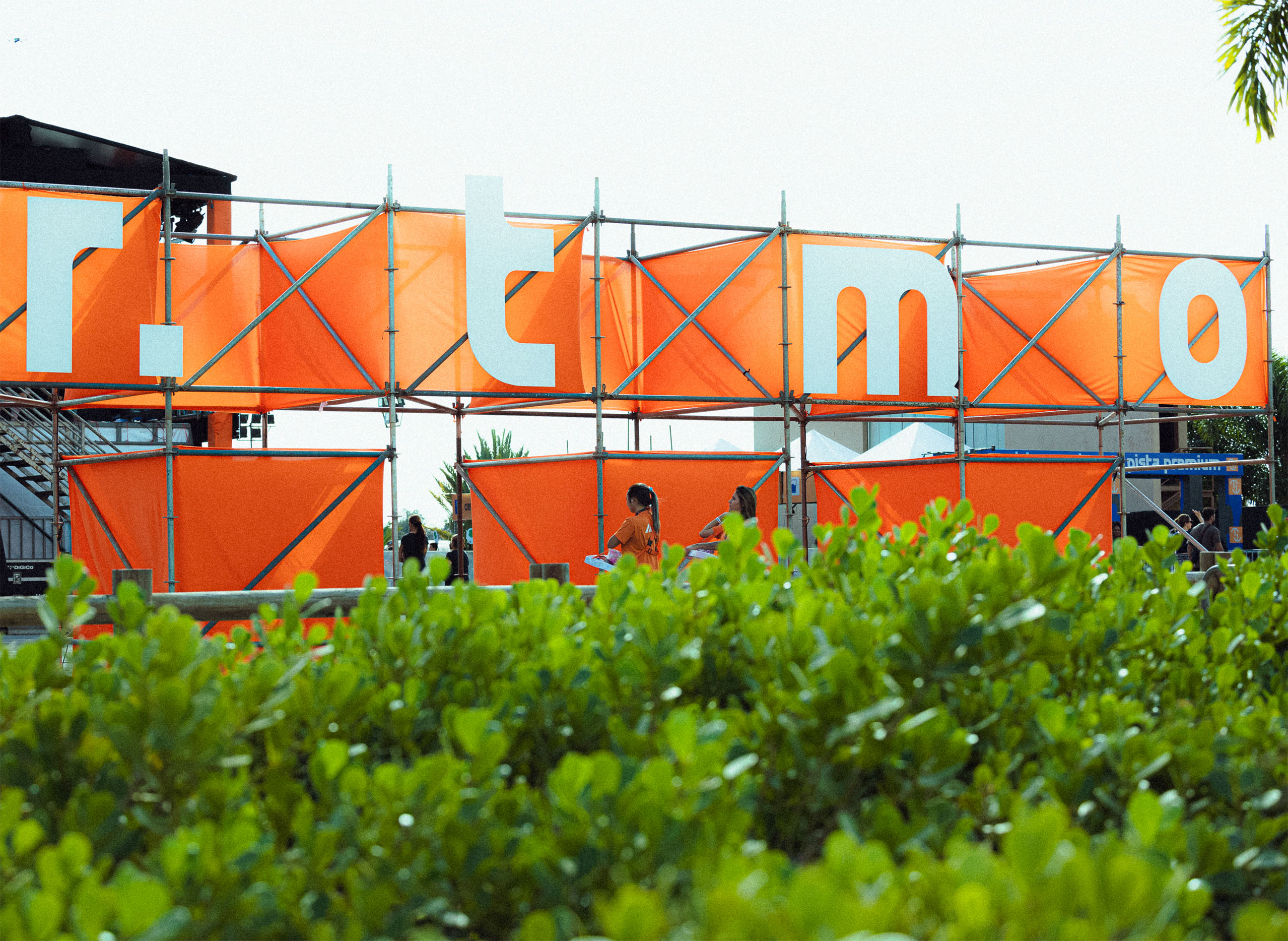
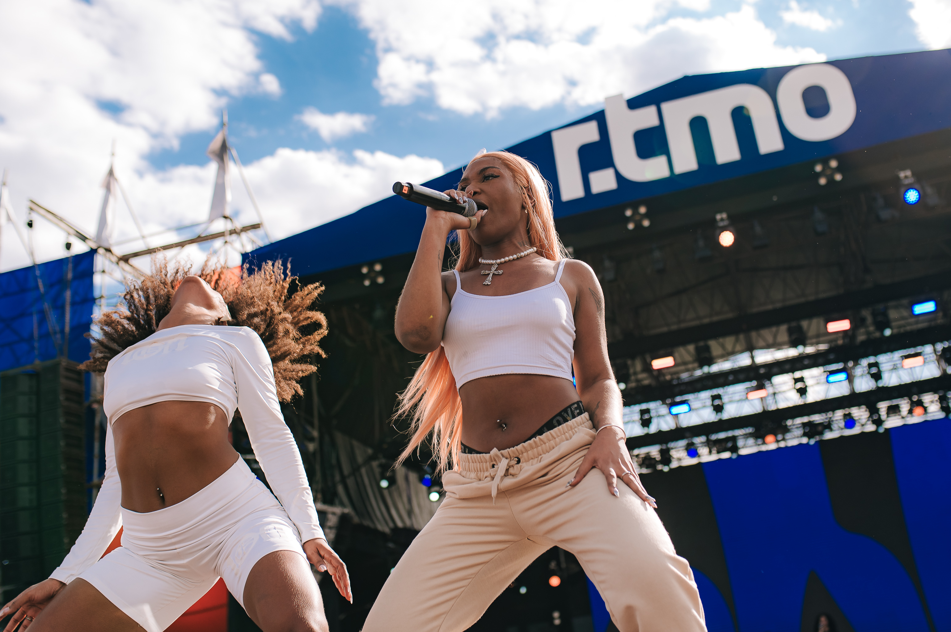
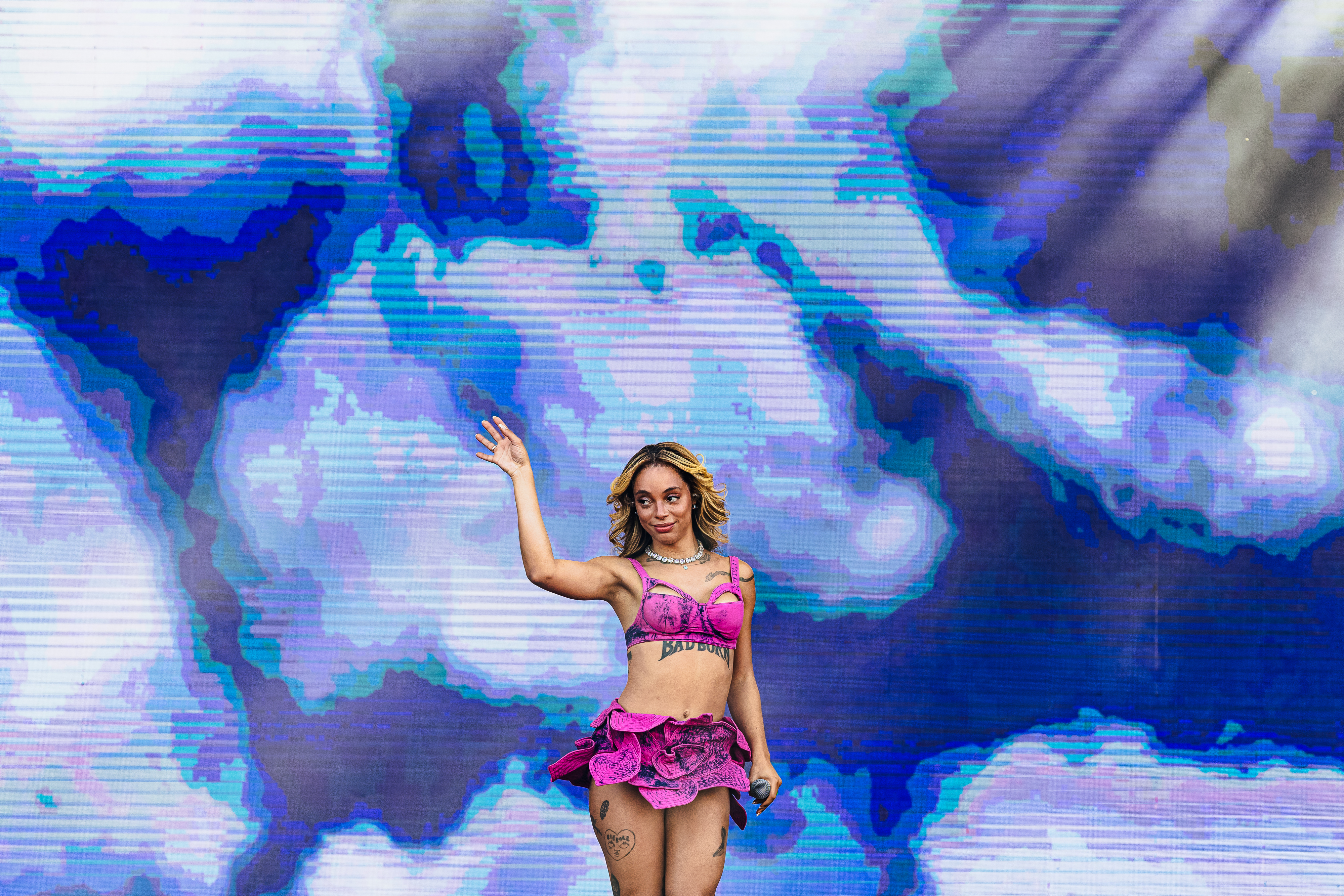
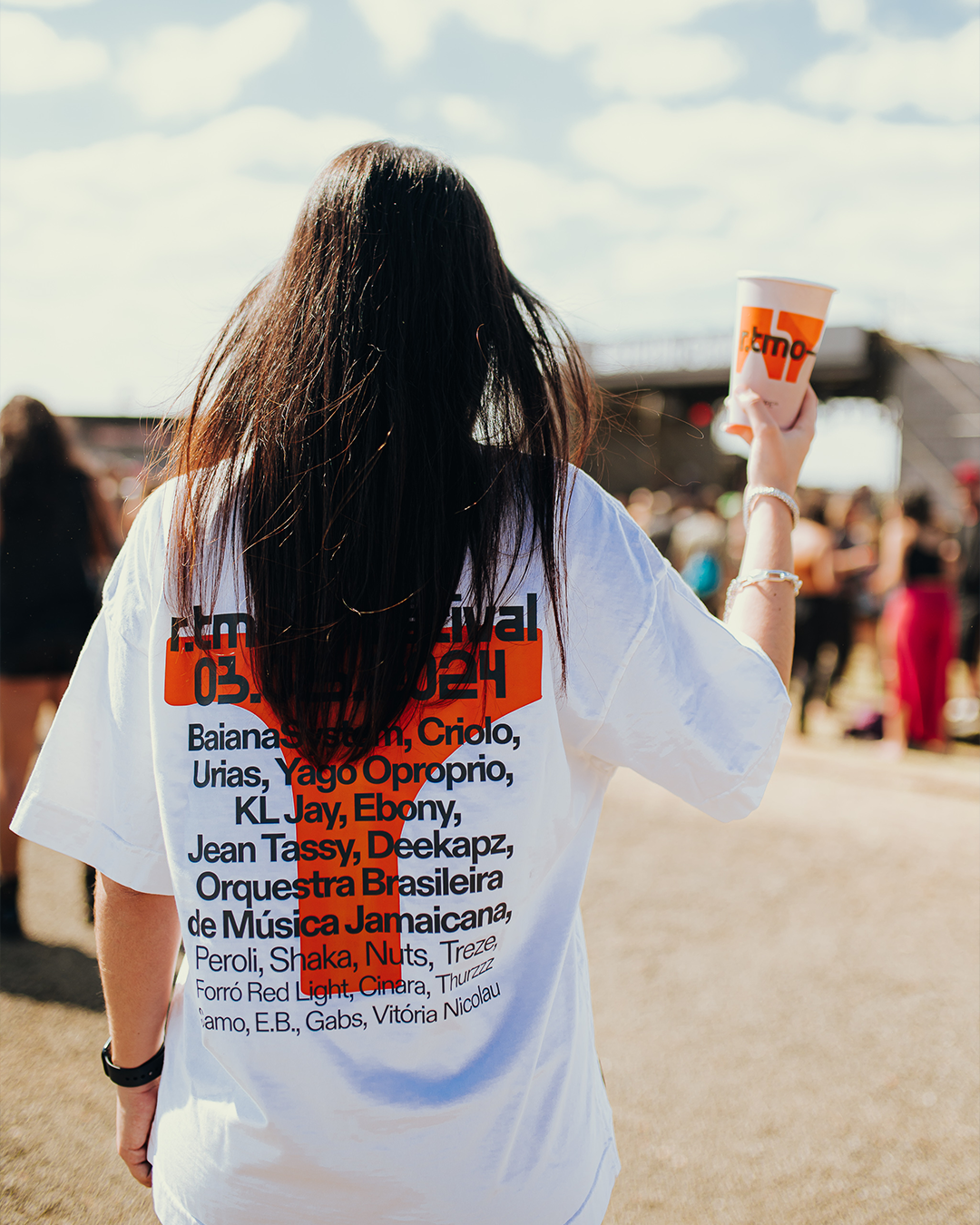
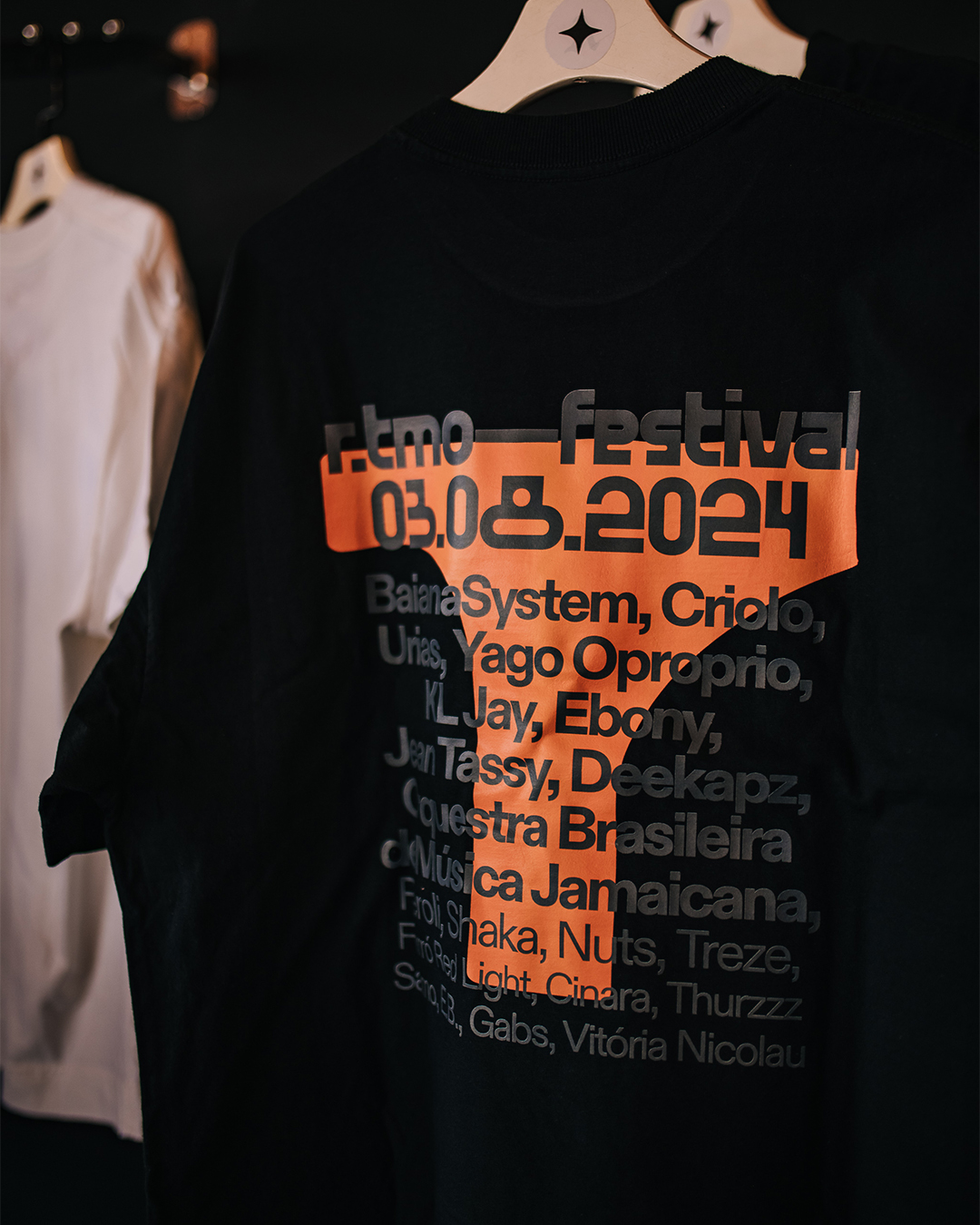
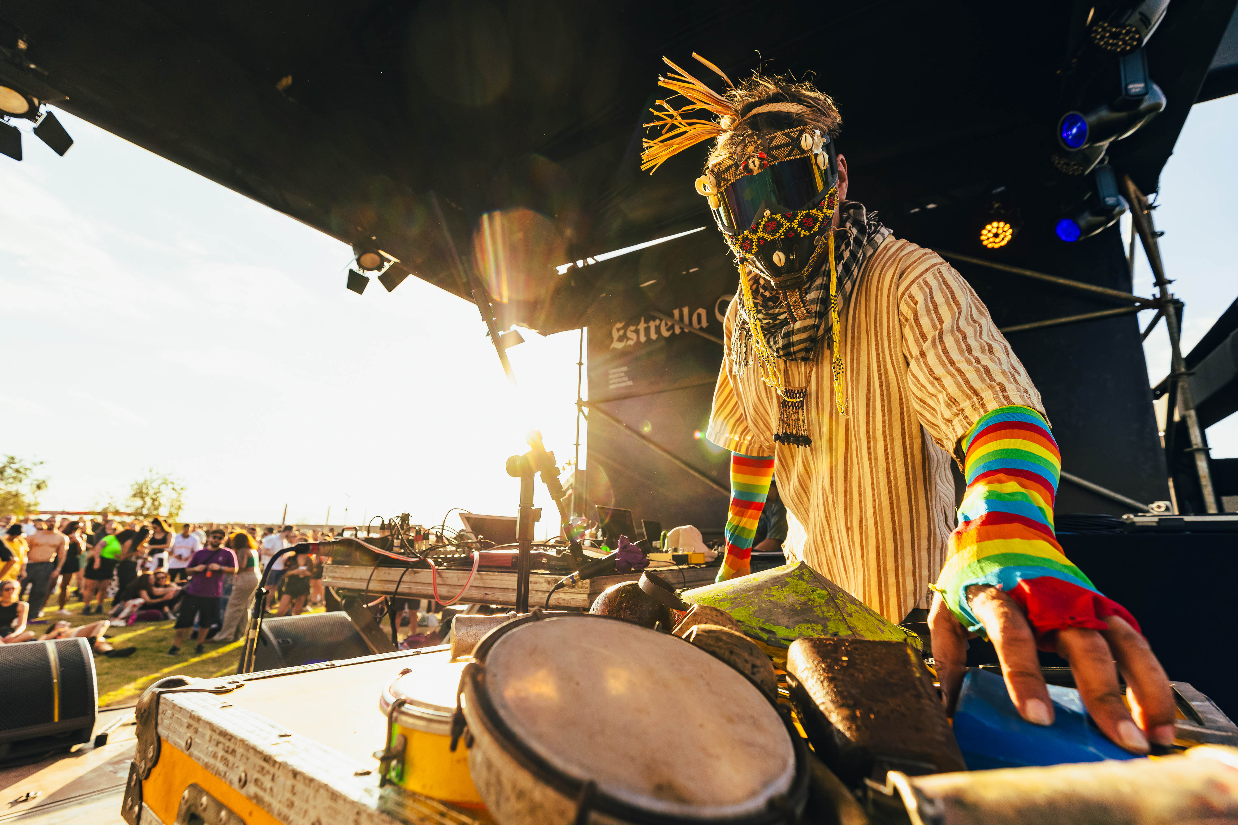
R.TMO is a festival held in Campinas (SP, Brazil) that celebrates the diversity of contemporary Brazilian music. The lineup showcases national artists who push the boundaries of what is traditionally known as Brazilian popular music, featuring names such as Criolo, BaianaSystem, Urias, among others.
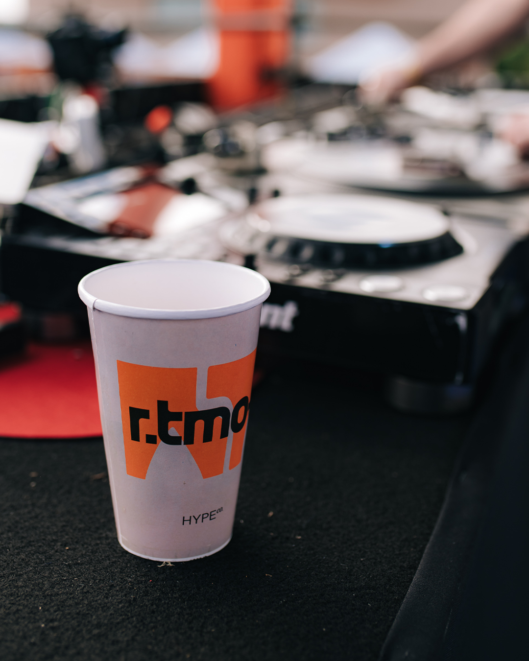
The challenge was to develop a visual identity that would break away from conventional clichés — especially the green and yellow color palette — and bring a more current, vibrant, and sonically diverse graphic approach.
To represent this diversity, we created a dynamic system of typography and animations, capable of taking on various shapes, distortions, and movements — reflecting the aesthetic freedom and rhythmic fluidity of the festival’s lineup.
The event took place on August 3, 2024, and attracted an audience of around 8,000 people.





Client: Weinbrenner
Studio: Pharus Bright Design
Creative Direction: Louise Haas
Graphic Design: Caio Oviedo; Rodrigo Gondim
Motion Design: Caio Oviedo; Rodrigo Gondim
Copy: Isabel Melo; Vivian Kanô
Studio: Pharus Bright Design
Creative Direction: Louise Haas
Graphic Design: Caio Oviedo; Rodrigo Gondim
Motion Design: Caio Oviedo; Rodrigo Gondim
Copy: Isabel Melo; Vivian Kanô
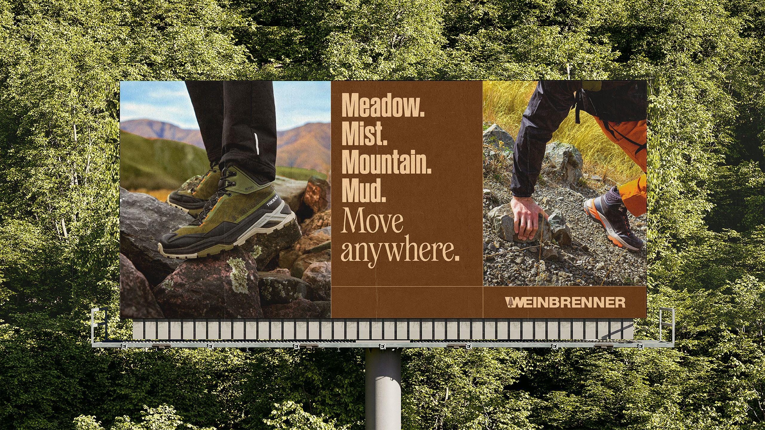
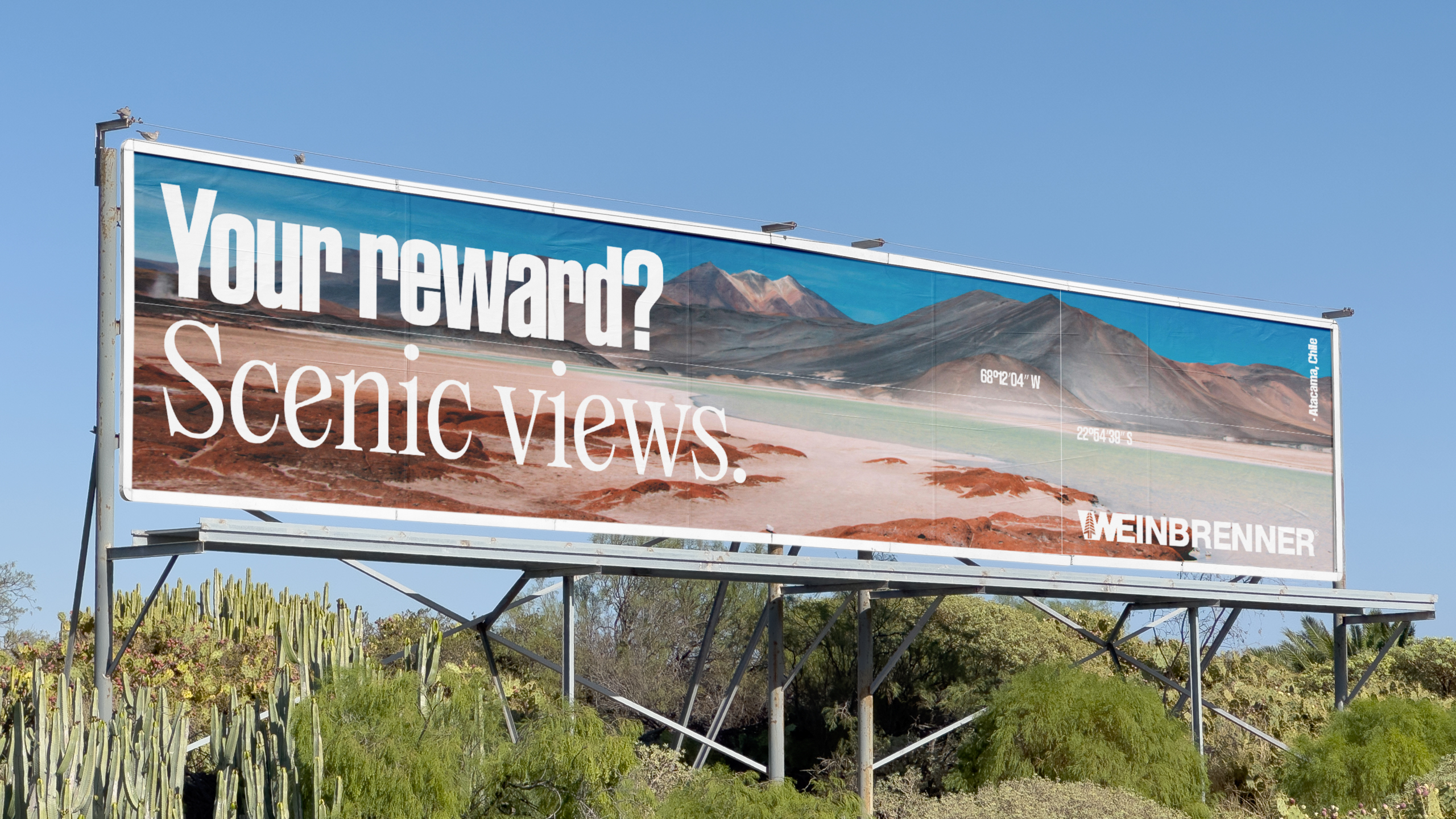
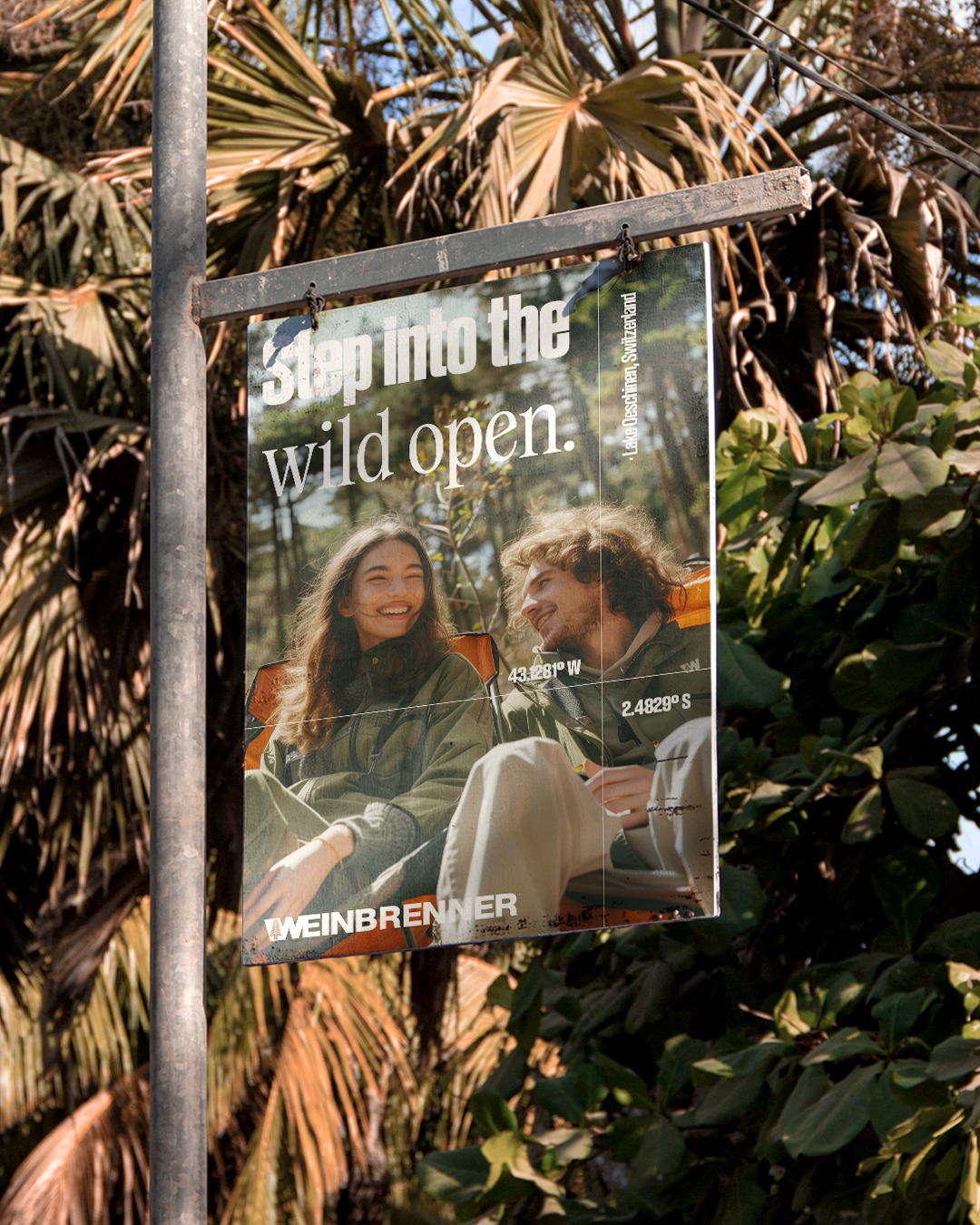
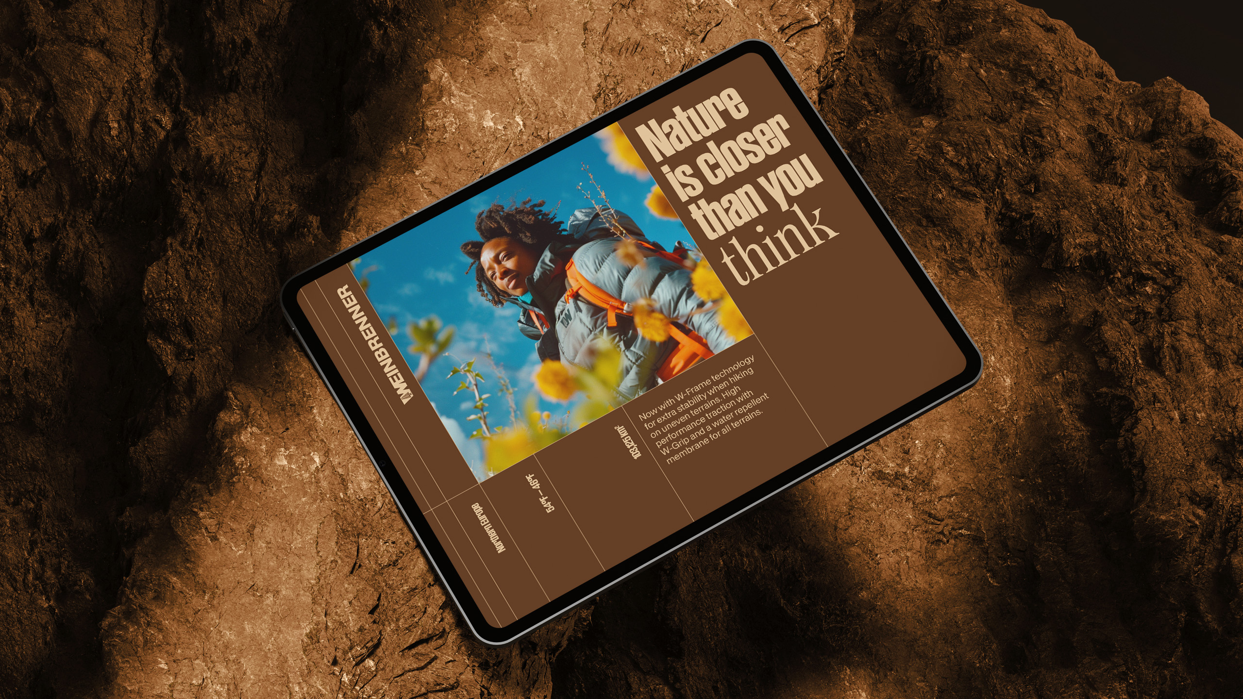
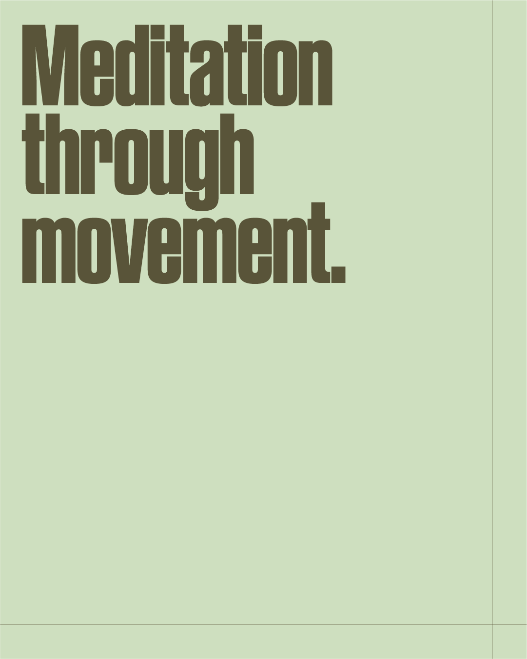
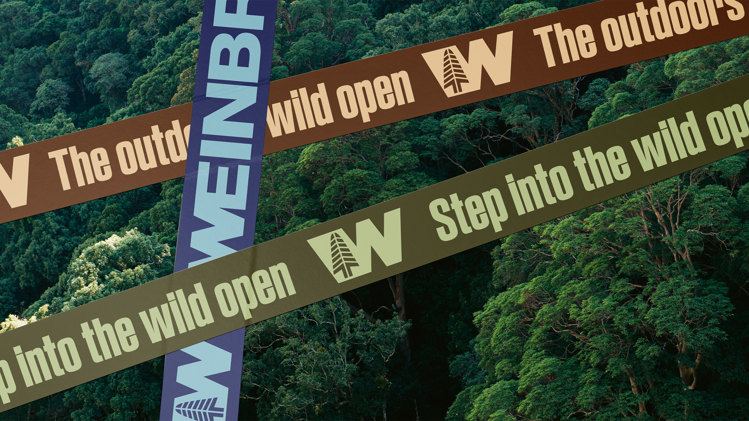
The renowned American brand of footwear and apparel for adventure sports, established in 1892, is renewing its visual identity with the concept "The Outdoors Wild Open." Inspired by world maps and topographic charts, the new visual language incorporates latitude and longitude lines, transforming every location into an invitation to explore wild and unexpected destinations. This cartographic approach, combined with grids, nature-inspired colors, and typography that merges a sporting spirit with the brand's tradition, creates a contemporary visual identity that honors its heritage while projecting it into a future of adventure and discovery.
Client: SOLO.etc
Production: Bartigga; Cecilia Lindgren; Lucas Mattara
Cenography: Gabriela Bruzadin
Pictures: Gabriela Bruzadin; Gabriel Vallada
Graphic Design and Motion Design: Caio Oviedo
Production: Bartigga; Cecilia Lindgren; Lucas Mattara
Cenography: Gabriela Bruzadin
Pictures: Gabriela Bruzadin; Gabriel Vallada
Graphic Design and Motion Design: Caio Oviedo
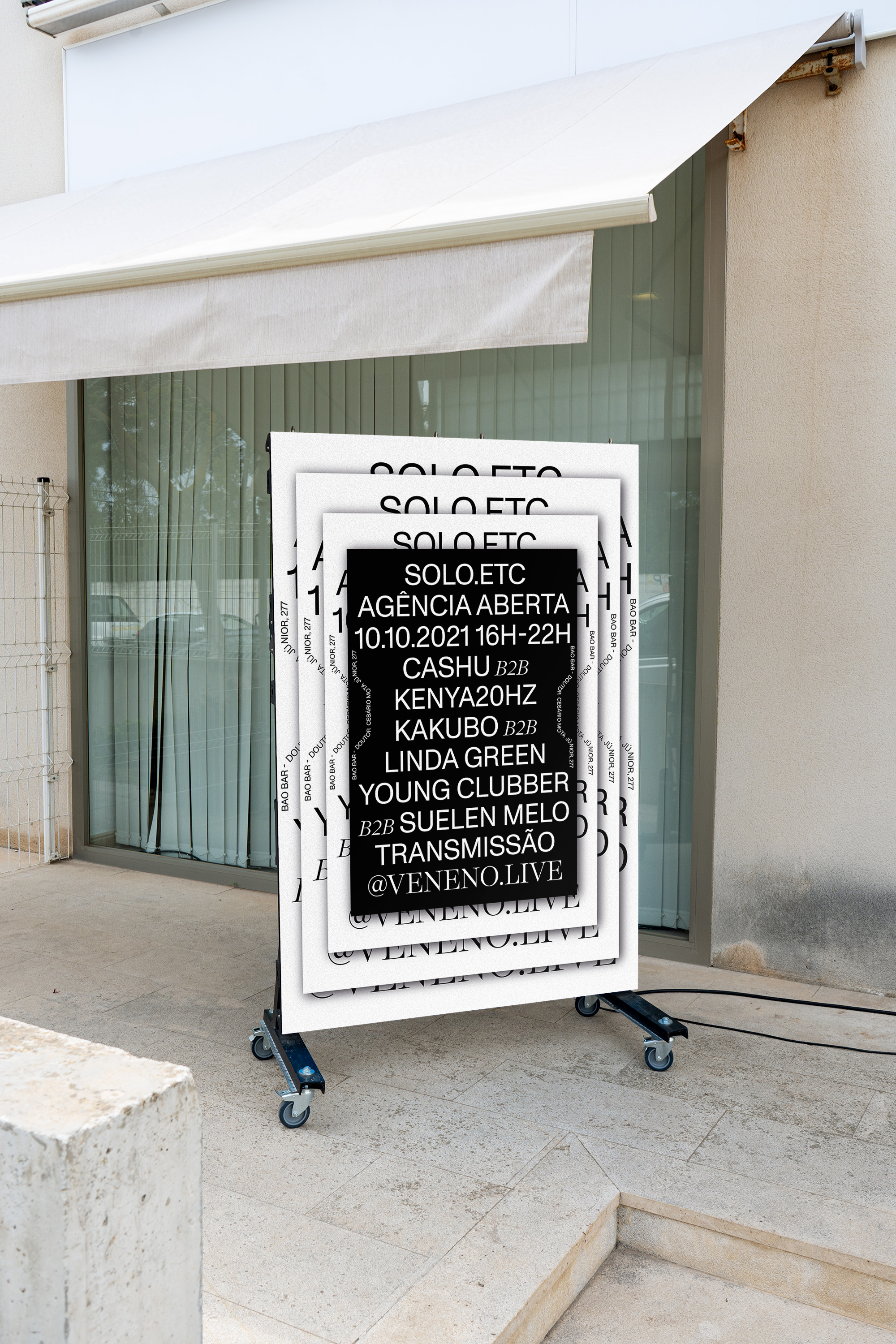
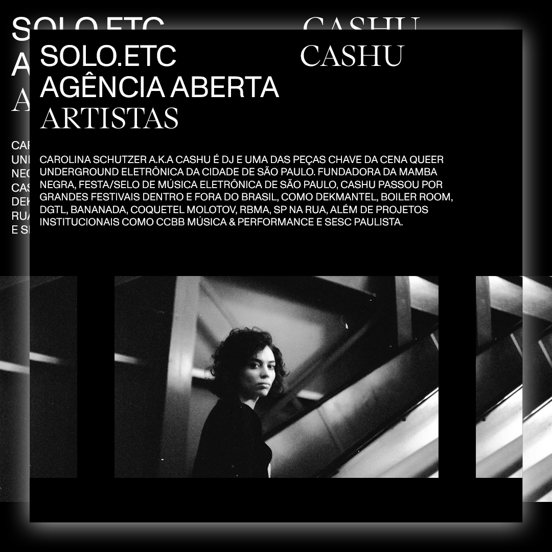
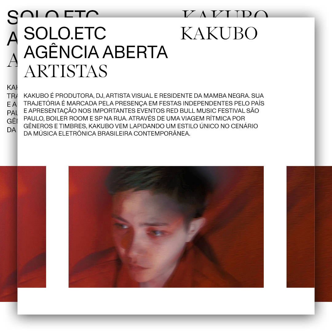
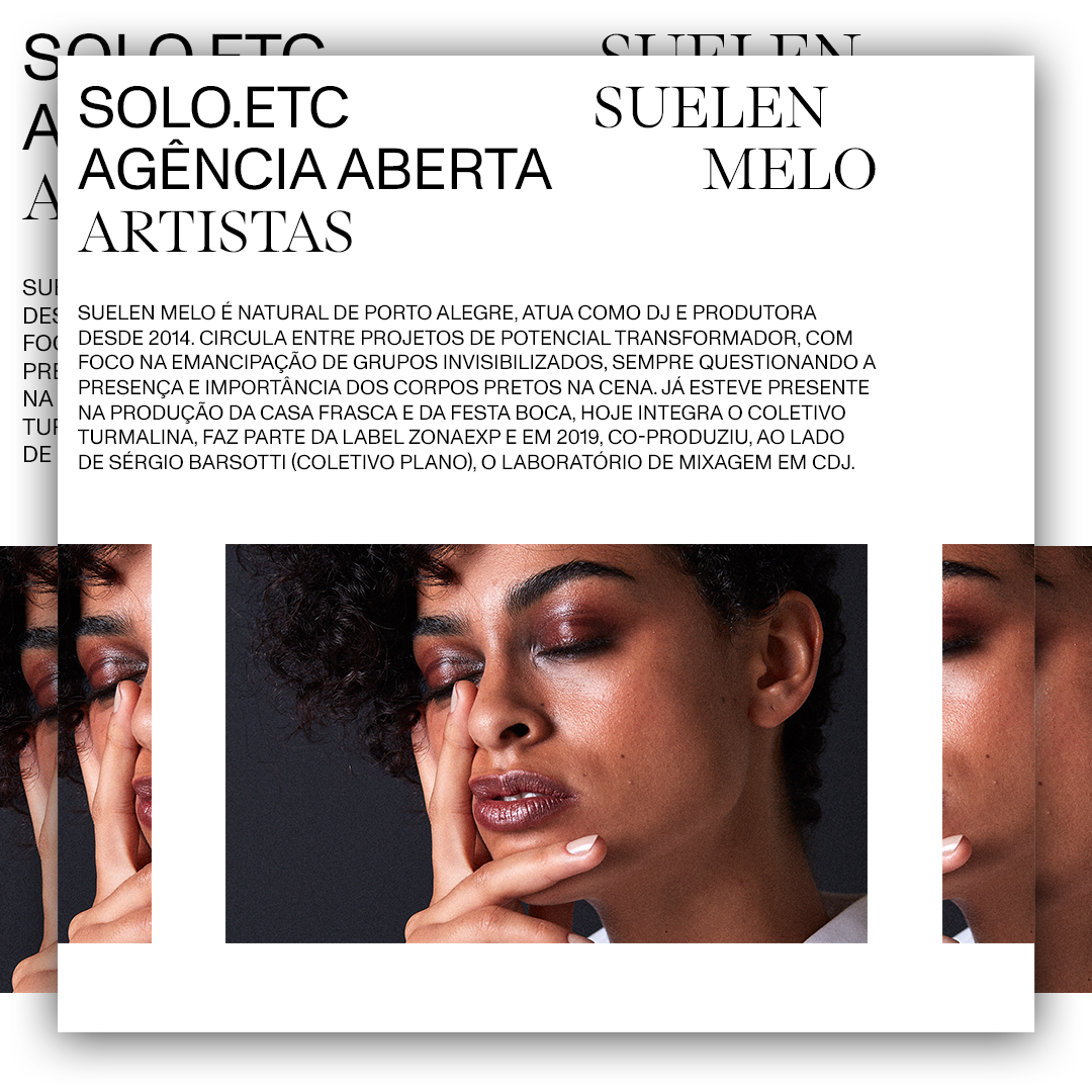
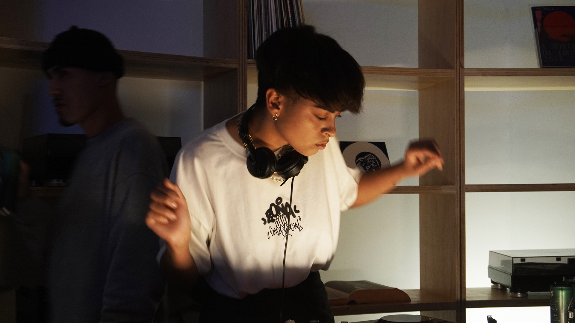
Founded in 2018, SOLO.etc is a creative agency based in São Paulo. SOLO works as a multidisciplinary laboratory, creating authoral and collaborative projects with brands, collectives, radios and other cultural organizations.
After almost two years with no presencial meetings, they created and produced an event called Agência Aberta (Open Agency) to inaugurate their new studio in partnership with Veneno.live Radio and the music label Lugar Alto.
After almost two years with no presencial meetings, they created and produced an event called Agência Aberta (Open Agency) to inaugurate their new studio in partnership with Veneno.live Radio and the music label Lugar Alto.









Client: SCRAP
Studio: SOLO.etc
Creative Direction: Caio Muratore
Graphic Design: Caio Oviedo; Gabriel Vallada
Motion Design: Caio Oviedo
Photography: Murilo Salazar
Studio: SOLO.etc
Creative Direction: Caio Muratore
Graphic Design: Caio Oviedo; Gabriel Vallada
Motion Design: Caio Oviedo
Photography: Murilo Salazar
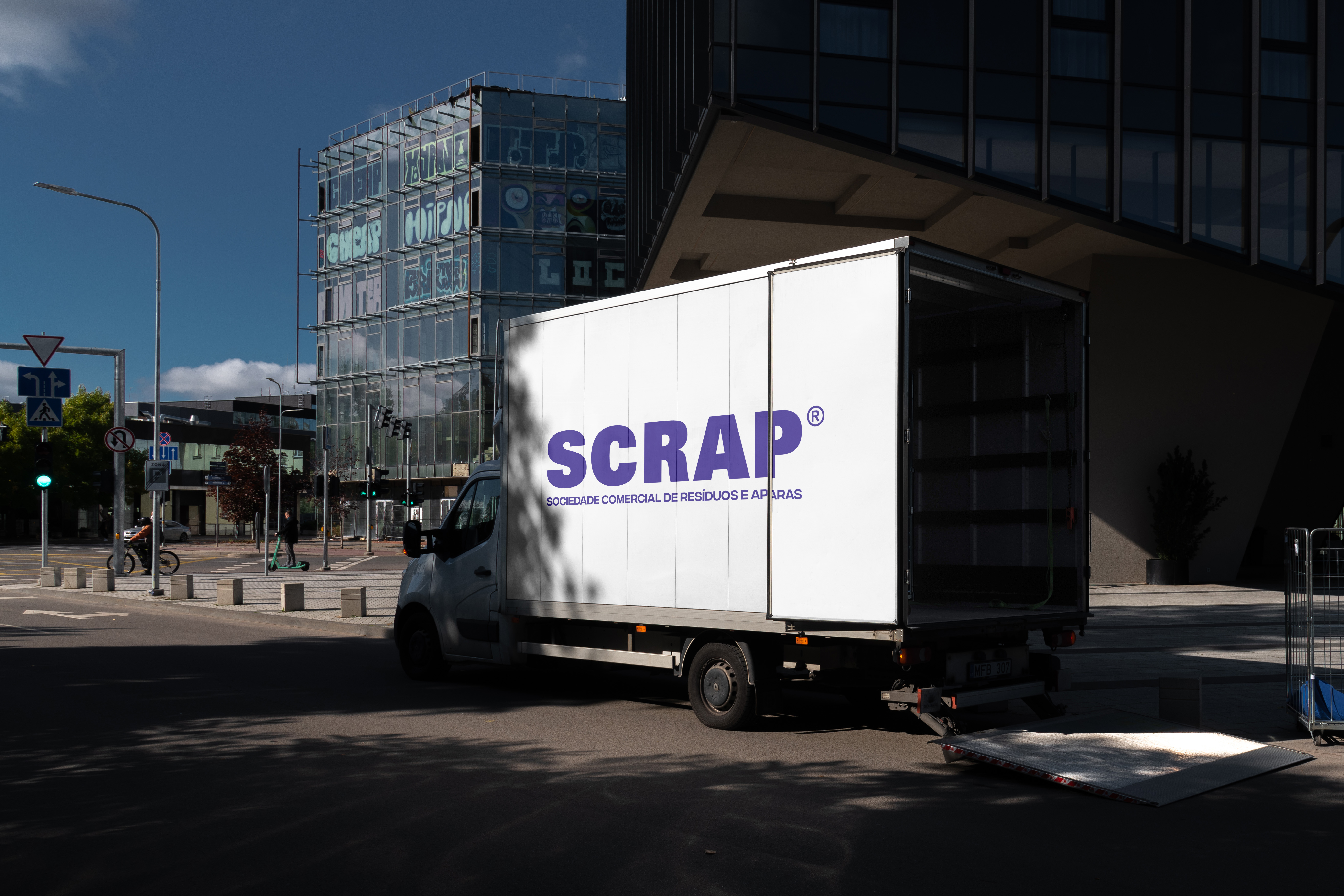
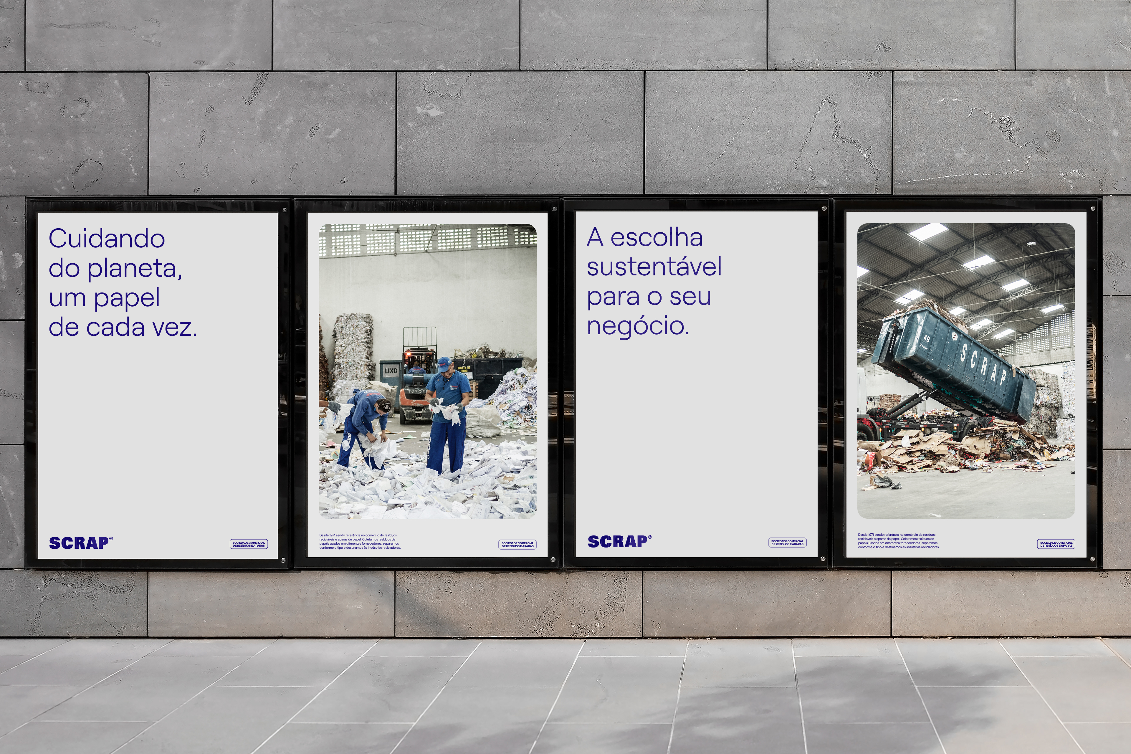
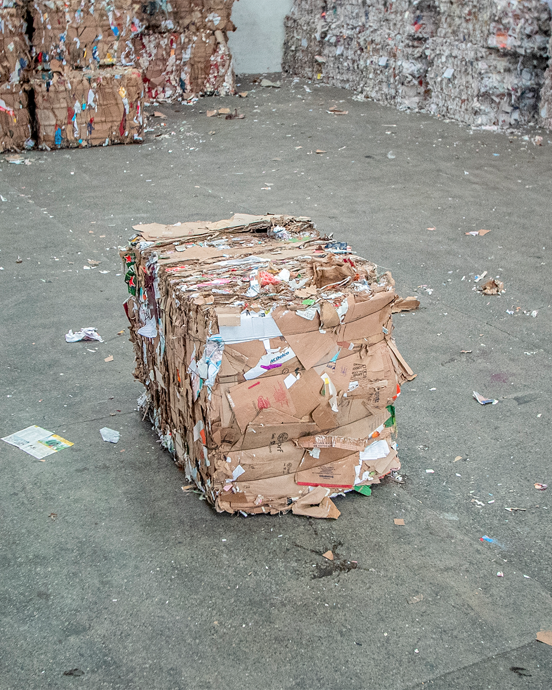
SCRAP is a company that acts on the commercialization of reciclable paper residue and scrap paper for recicling since 1971.
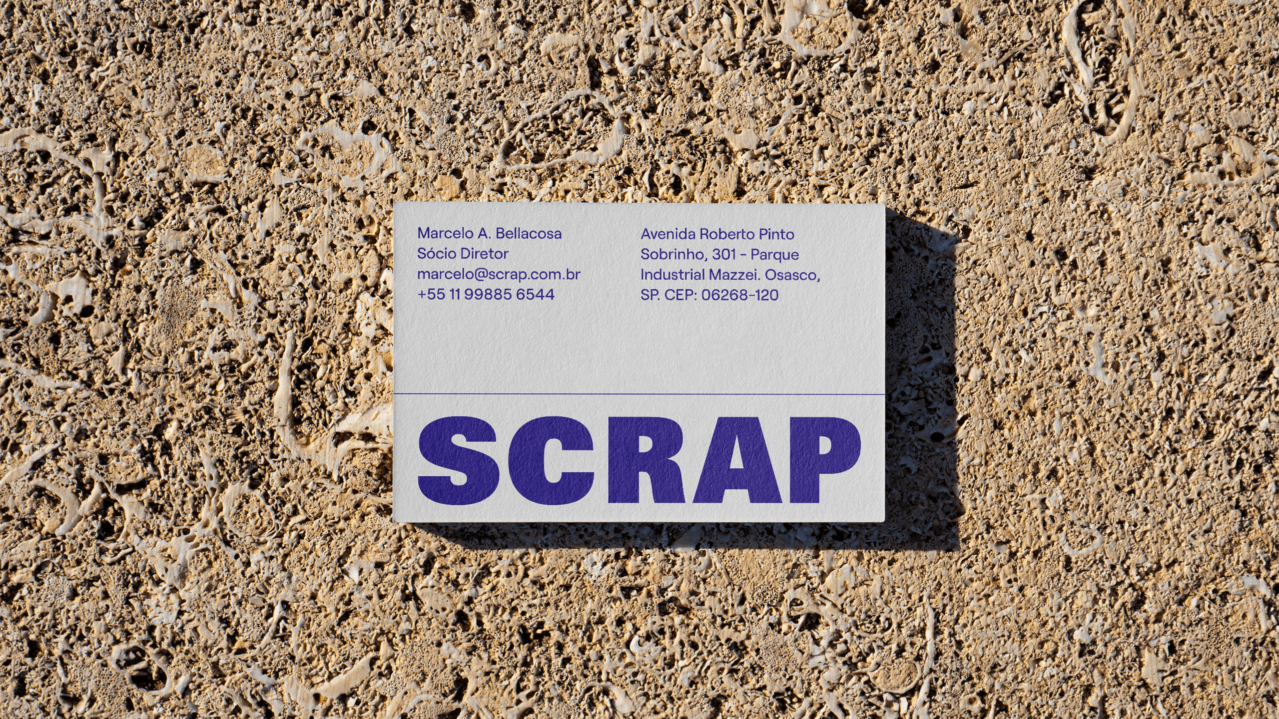
SOLO.etc was invited to refresh their identity and introduce the company to digital fields, by updating their logo, developing a new brandbook, strategy, social media contents and other graphic materials.
SOLO.etc was invited to refresh their identity and introduce the company to digital fields, by updating their logo, developing a new brandbook, strategy, social media contents and other graphic materials.
